Designing responsive image layouts with Jekyll
Performance is one of the key reasons I chose to build my site using a static site generator. But high quality images are also important to me, and I did not want to chose between imagery and performance. Early in the process, I spent some time learning about responsive image methods and later created a liquid include tag based on what I learned.
There are a number of great articles that go into different methods. I’ve listed them at the bottom.
Quick note: Rouge, the syntax highlighter used by default with Jekyll, does not seem to know how to handle the new attributes used with the img element. Rouge also appears confused by the combination of the new img attributes and liquid. Some of the embedded snippets below may look a bit strange below as I work out the kinks.
Srcset with width and sizes
Creating clever solutions can backfire when you have to regularly use them or maintain them. This is one of the reasons I like the simplicity of using srcset with width descriptions over alternate css, picture or javascript solutions.
At its simplest, srcset and size attributes tell the browser what to anticipate the layout will do, and image sizes available to use in that layout. With that information, the browser determines which image file to actually display.
I’m a big fan of letting a browser do what it does best: displaying content the best way it can. srcset let’s the browser keep that power.
Here is basic starting example:
<img src=“filepath/image.png”
srcset=“filepath/image.png 100w, filepath/image2.png 200w, filepath/image3.png 300w”
sizes="100vw"
alt="image alt text">
src and alt attributes are still necessary for fallback and accessibility support. But aside from this, we are giving the browser two sets of pieces of information: srcset and sizes.
Srcset: the base ingredient for responsive magic
srcset is where the design power lies. You can have as many or as few files listed per image element as you’d like.
<img src=“filepath/image.png”
srcset=“filepath/image.png 100w, filepath/image2.png 200w, filepath/image3.png 800w, filepath/image4.png 1200w, filepath/image5.png 1920w”
sizes="100vw"
alt="image alt text">
It’s a list of file paths followed with a specific width description for that image. Each image included in the list is separated by commas. Width descriptions get a little weird with srcset, using a vague w unit. For example, 100w means 100px wide. Other image sizes might be 1200w (1200px), 800w (800px), or 1920w (1920px), and so on.
This list of images let’s you micromanage the experience your users have. The browser doesn’t care if this is the exact same image scaled down or not. It cares about the file path and the image widths. This allows us to use any art direction technique within the images themselves that we may want.
Or, you can batch run your largest image size through an editor to scale down at pre-defined intervals. (Don’t forget to run the output images through an optimizer such as TinyPNG, or TinyJPG!)
On its own, srcset gives you carrots but not carrot cake. There isn’t enough information here for the browser to determine which image to use. Your mark up is only informing the browser what sizes are available.
Sizes: Sugar, spice and everything nice.
The sizes attribute helps the browser identify how to use the provided image sizes. In my super basic example:
<img src=“filepath/image.png”
srcset=“filepath/image.png 100w, filepath/image2.png 200w, filepath/image3.png 300w”
sizes="100vw"
alt="image alt text">
I only use sizes=“100vw”. This tells the browser that this image should display at viewport width 100%, all the time.
In reality, your layout will likely change depending on the browser size. (Responsive design, y’all.) The sizes attribute can handle media queries, pixel units, viewport widths, and calc(). Separate each part of the list with commas.
So simple, right?
All parts combined, this looks something like:
<img src=“filepath/image.png”
srcset=“filepath/image.png 100w, filepath/image2.png 200w, filepath/image3.png 300w”
sizes=“(min-width: 650px) calc(50vw - 20px), (min-width: 1100px) calc(33vw - 20px), 100w”
alt="image alt text">
Yeah, okay, it’s not actually that simple. But relative to other responsive method solutions out there, this one still feels the most intuitive and straight forward to me.
Here is an example from another blog post how an image element looks in the markup:
Shortcomings of this method
This method isn’t without its drawbacks. Aside from making the img element more complex, you also do not get fine control over which image displays when. This means that you may end up with moments where your images will appear blurry or pixelated to your users. I personally believe that despite this, this method wins out over others.
Includes: An imperfect solution for responsive images in Jekyll
This is one part of this method that still bums me out a bit. That img element above is a lot to include in a markdown file. Especially, if you have a block of several images as part of your content.
Using an include to handle responsive images is going to be overkill for some folks. It’s really going to be most useful if you are wanting to use the images in a layout template specifically.
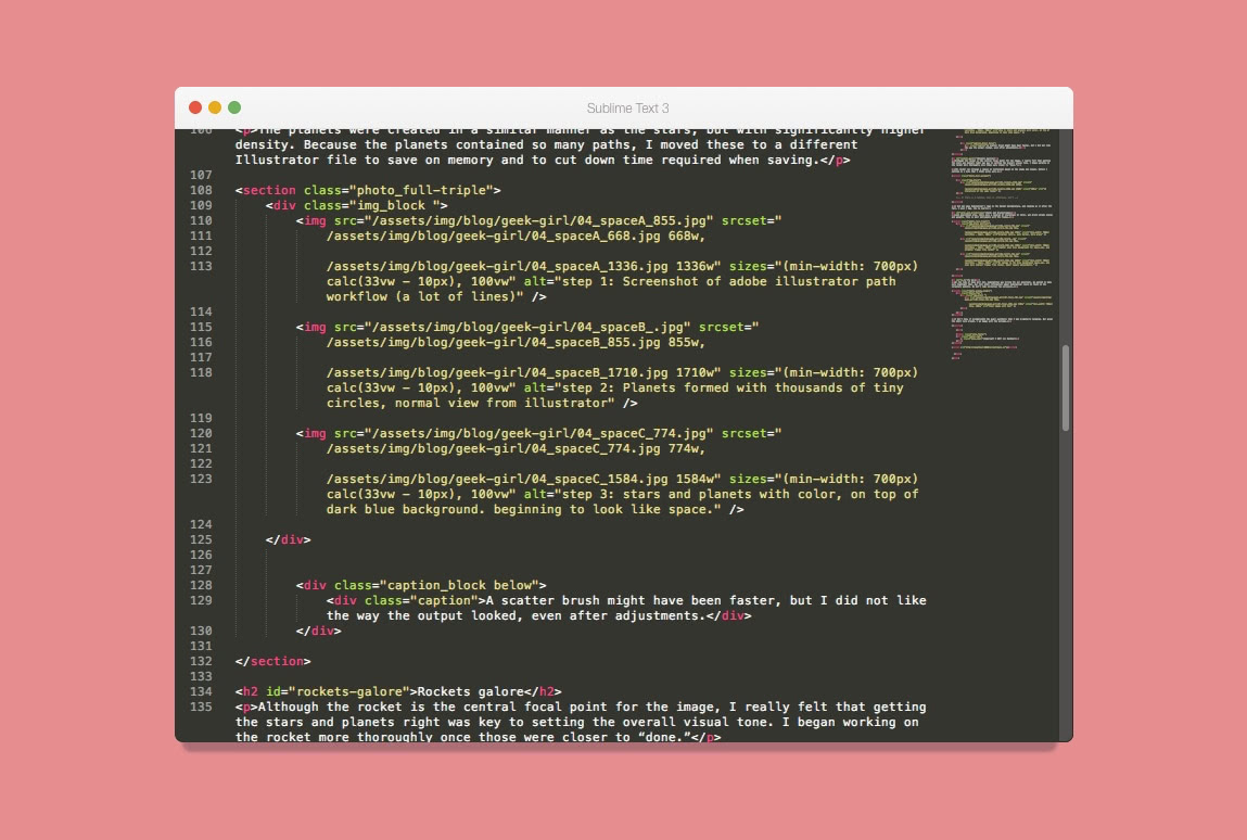
Here is an example of how my some of my image block templates look in the wild. (Full blog post here)
The most direct solution is to insert a block of html and img elements as shown in the previous markup image. But then you lose the benefit of Jekyll and liquid — reusable templates.
Setting up the include template
I will assume that if you are continuing to read, you have some familiarity with Jekyll, liquid, and includes.
The example img element we looked at earlier has three spots that can be quickly changed to liquid:
<img src="{{ site.baseurl }}/filepath/{{ include.img_name }}.jpg"
srcset=“filepath/image.png 100w, filepath/image2.png 200w, filepath/image3.png 300w”
sizes=“(min-width: 650px) calc(50vw - 20px), (min-width: 1100px) calc(33vw - 20px), 100w”
alt="{{ include.img_alt }}">
{{ site.baseurl }}is an default Jekyll tag that will give you the base URL necessary for your file path.{{ include.img_name }}creates an argument for your fallback filename.{{ include.img_alt }}creates an argument for the alt text of your image.
There are a couple of built in assumptions into the above snippet:
- You will always want your image files in the same location:
filepath - You will always use a .jpg as your image file format
It’s easy enough to change both:
- To have more granular control over the file path of your images, create an additional include argument in place of
filepath. For example,{{ include.img_path }} - To have control over the file type, leave out the extension after the
img_nameargument.
Adding arguments for Srcset support
Here is where I found having a consistent naming structure is key. Looking back at our initial example using srcset:
<img src="{{ site.baseurl }}/filepath/{{ include.img_name }}.jpg"
srcset=“filepath/image.png 100w, filepath/image2.png 200w, filepath/image3.png 300w”
sizes=“(min-width: 650px) calc(50vw - 20px), (min-width: 1100px) calc(33vw - 20px), 100w”
alt="{{ include.img_alt }}">
…we now have several images we need to account for. The simplest solution is to name your images as similarly as possible. For example, use the same file name, but only modify the suffix. For example: “image_x,” “image_y”, “image_z.”
By doing this you can reduce the number of required attributes to one image name, and its associated widths.
<img srcset="{{ site.baseurl }}/filepath/{{ include.img_name }}_{{ include.w1 }}.jpg {{ include.w1 }}w,
{{ site.baseurl }}/filepath/{{ include.img_name }}_{{ include.w2 }}.jpg {{ include.w2 }}w,
{{ site.baseurl }}/filepath/{{ include.img_name }}_{{ include.w3 }}.jpg {{ include.w3 }}w" >
In its simplest form, I am declaring the file path. That path looks like this: http://domain.com/filepath/img_name_w1.jpg. This image has a width description that equals w1, etc. To make this work, you only need to name your files with one name, and use a suffix matching the image width.
All together: (I am assuming the middle image size is the fallback, your mileage may vary.)
<img src=“filepath/{{ include.img_name }}_{{ include.w2 }}.jpg”
srcset="{{ site.baseurl }}/filepath/{{ include.img_name }}_{{ include.w1 }}.jpg {{ include.w1 }}w,
{{ site.baseurl }}/filepath/{{ include.img_name }}_{{ include.w2 }}.jpg {{ include.w2 }}w,
{{ site.baseurl }}/filepath/{{ include.img_name }}_{{ include.w3 }}.jpg {{ include.w3 }}w"
sizes=“(min-width: 650px) calc(50vw - 20px), (min-width: 1100px) calc(33vw - 20px), 100w”
alt="{{ include.img_alt }}">
And when you call it outside of the include, it should look something like this:
{% include images.html
folder="assets/images/examplepath"
img_name="example"
img_fallback="800"
w1="600"
w2="800"
w3="1100"
img_alt="my image alt text here" %}
Alright. Not so bad. But with only one image, and no layout requirements, this setup may not be worth the work.
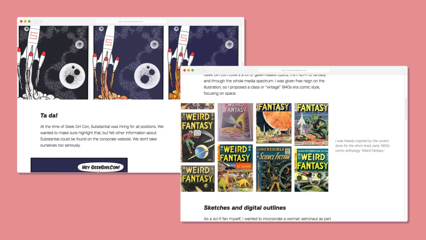
Image blocks and captions
As you could see in my screenshots above. My images appear as part of layout templates. Including captions, and multi-image blocks. This is not that hard to do. But once again, a consistent naming pattern will simplify this.
<img src=“filepath/img1_w2.png”
srcset="{{ site.baseurl }}/filepath/{{ include.img1_name }}_{{ include.img1_w1 }}.jpg {{ include.img1_w1 }}w,
{{ site.baseurl }}/filepath/{{ include.img_name }}_{{ include.img1_w2 }}.jpg {{ include.img1_w2 }}w,
{{ site.baseurl }}/filepath/{{ include.img_name }}_{{ include.img1_w3 }}.jpg {{ include.img1_w3 }}w"
sizes=“(min-width: 650px) calc(50vw - 20px), (min-width: 1100px) calc(33vw - 20px), 100w”
alt="image alt text">

<img src=“filepath/image.png”
srcset="{{ site.baseurl }}/filepath/{{ include.img2_name }}_{{ include.img2_w1 }}.jpg {{ include.img2_w1 }}w,
{{ site.baseurl }}/filepath/{{ include.img_name }}_{{ include.img2_w2 }}.jpg {{ include.img2_w2 }}w,
{{ site.baseurl }}/filepath/{{ include.img_name }}_{{ include.img2_w3 }}.jpg {{ include.img2_w3 }}w"
sizes=“(min-width: 650px) calc(50vw - 20px), (min-width: 1100px) calc(33vw - 20px), 100w”
alt="{{ include.img_alt }}">

{% if include.caption %}
   <div class="caption_layout">
      <div>{{ include.caption }}</div>
   </div>
{% endif %}
That include is definitely getting longer and harder to read. And this is the include tag you would insert into your post or page:
{% include images.html
folder="assets/images/examplepath"

img1_name="example"
img1_w1="600" img1_w2="800" img1_w3="1100"
img1_alt="my image alt text here"

img2_name="example2"
img2_w1="600" img2_w2="800" img2_w3="1100"
img2_alt="my image alt text here"

caption="Some caption words!" %}
Compared to the mess that comes before it, this solution is far simpler! Even if you were including straight HTML and not a templated version, responsive images get verbose.
And in the particular example I used above — I made the caption optional with an if statement. For this include, the two images and their associated attributes are always required. But the caption is optional.
This isn’t the most elegant solution, but it is the easiest to remember and so far the most effective. You can also make almost any part of the the img element and its associated attributes part of your template. That’s great for adding customization to your individual blocks. You can even use include attributes to add optional css classes. Think about all that design potential!
A possible trap: A fixed number of images
One of the arguments I had earlier on in favor of the srcset and sizes method was that you have granular control over the experience users will have.
When you begin to create a templated include, however, you lose some of that flexibility. In the specific examples above, there must always be 3 image file paths and widths provided as arguments for the include. At the moment. There are times when having 3 versions of one image simply doesn’t make sense.
In that instance, we can make our include templates a bit more verbose, but allow for more flexibility. Even so, we will unintentionally or not set a max number of widths we can support. Here is an example of using {% if %} statements as part of the include to allow up to five image widths.
<img src=“filepath/{{ include.img_name }}_{{ include.w2 }}.jpg”
srcset="{{ site.baseurl }}/filepath/{{ include.img_name }}_{{ include.w1 }}.jpg {{ include.w1 }}w,
{{ site.baseurl }}/filepath/{{ include.img_name }}_{{ include.w2 }}.jpg {{ include.w2 }}w,
{{ site.baseurl }}/filepath/{{ include.img_name }}_{{ include.w3 }}.jpg {{ include.w3 }}w
   {% if include.w4 %}
   , {{ site.baseurl }}/filepath/{{ include.img_name }}_{{ include.w4 }}.jpg {{ include.w4 }}w
   {% endif %}
   {% if include.w5 %}
   , {{ site.baseurl }}/filepath/{{ include.img_name }}_{{ include.w5 }}.jpg {{ include.w5 }}w
   {% endif %}"
sizes=“(min-width: 650px) calc(50vw - 20px), (min-width: 1100px) calc(33vw - 20px), 100w”
alt="{{ include.img_alt }}">
The include tag you would use in posts and pages:
{% include images.html folder="assets/images/examplepath"
img_name="example"
img_fallback="800"
w1="600" w2="800" w3="1100" w4="1400" w5="1920"
img_alt="my image alt text here" %}
You can use this same method in any multi-image block. Just combine the {% if %} statements with any <img> element used as part of a template.
Parting thoughts
Including responsive images in your website is going to be a moderate pain in the rear. But there are ways to make the process a little easier for templates in Jekyll.
An even smoother solution would be a Jekyll plugin. Here are two that I looked at:
Unforunately, neither exactly fits how I’d like to have my images behave. So, for now I’ll continue to use the include method I’ve shown above.