Geek Girl Con x Space: sponsorship illustration
I used to do a lot of illustration just for fun, so when I was given a chance to do it for work I took it. In the fall of 2016, Substantial sponsored a local event called Geek Girl Con. As part of our sponsorship package, Substantial was given one of the slots on the electronic display boards in the lobby. Because of a miscommunication, I had about four days to do this illustration.
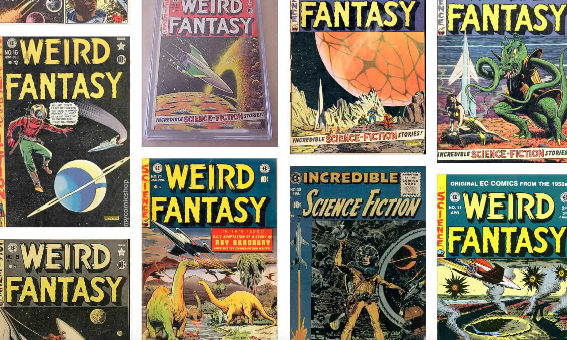
Concept & mood board
Geek Girl Con covers a lot of geek-related topics, from sci-fi to fantasy and through the whole media spectrum. I was given free reign on the illustration, so I proposed a class or “vintage” 1940s era comic style, focusing on space.
Sketches and digital outlines
As a sci-fi fan myself, I wanted to incorporate a woman astronaut as part of the poster along with a space ship. While I was sketching, I began to visualize in my head how to bring these two parts together, but never captured that layout concept as a sketch.
Ultimately, I struggled to make the woman’s body position look less awkward, and because of the short timeline I focused solely on the spaceship concept instead.
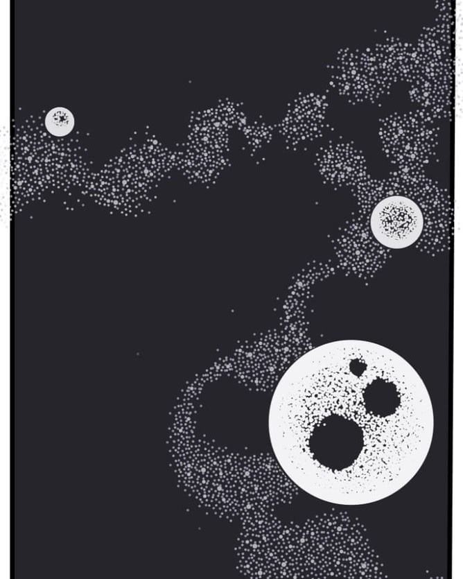
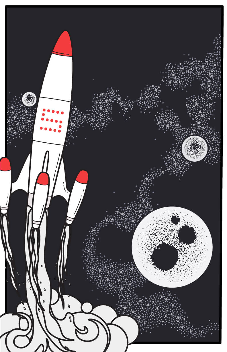
Building Space, one tiny circle at a time.
One of the things I noticed from my mood board with older comics was that shading and details were often line and dot based. For that reason, I wanted to build the stars and the planets the same way.
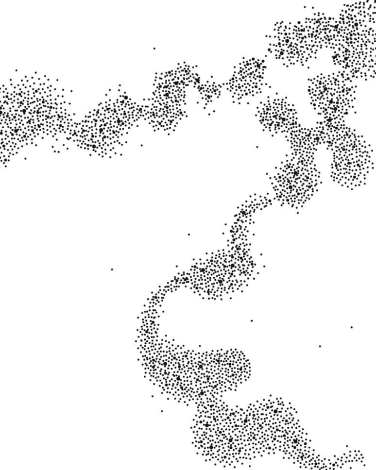
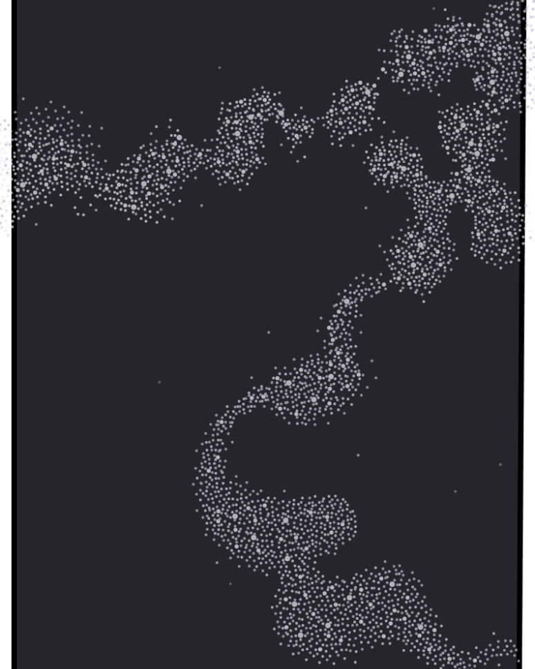
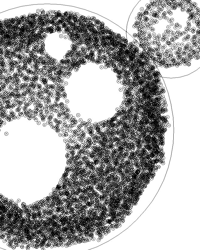
First, the stars
I started with a series of circles of similar but not exactly the same size. Each cluster of circles was copy-and-pasted, then adjusted one by one. Using brighter colors at the start helped me identify where I had created unintentional patterns so that I could adjust appropriately. I then switched to black and white, then the “space colors.”
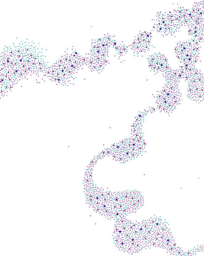
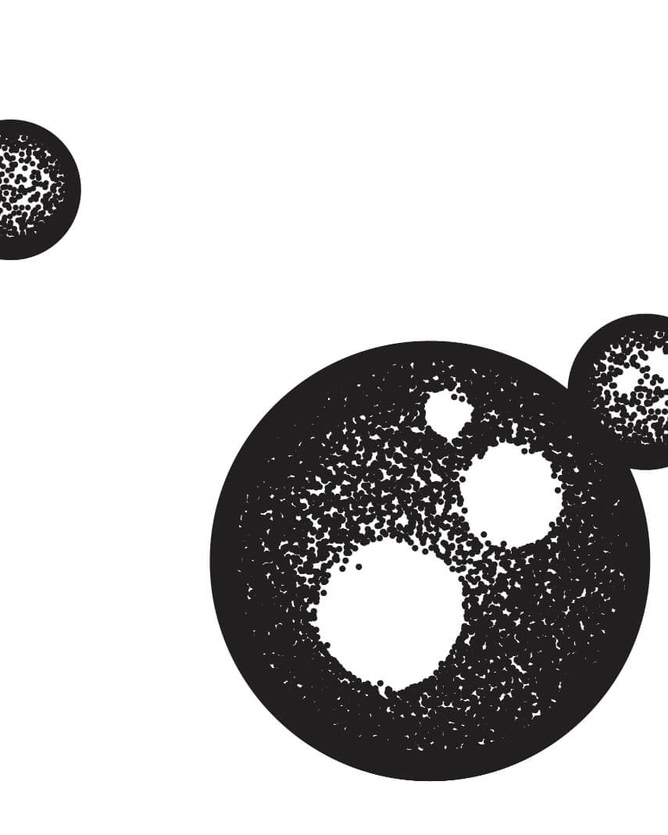
Second, the Planets
The planets were created in a similar manner as the stars, but with significantly higher density. Because the planets contained so many paths, I moved these to a different Illustrator file to save on memory and to cut down time required when saving.
Rockets galore
Although the rocket is the central focal point for the image, I really felt that getting the stars and planets right was key to setting the overall visual tone. I began working on the rocket more thoroughly once those were closer to “done.”
The rocket ran through a couple of iterations based on the shape and layout, before I settled on a size that I think works well.
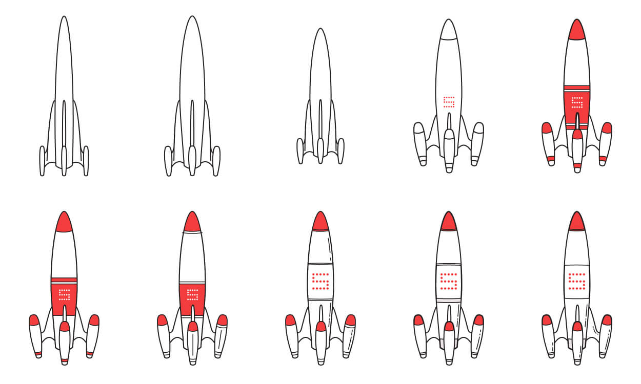
I did not skew Substantial’s logo on the Rocket deliberately, and looking at it after the fact, I wish I had. (Ce la vie!)
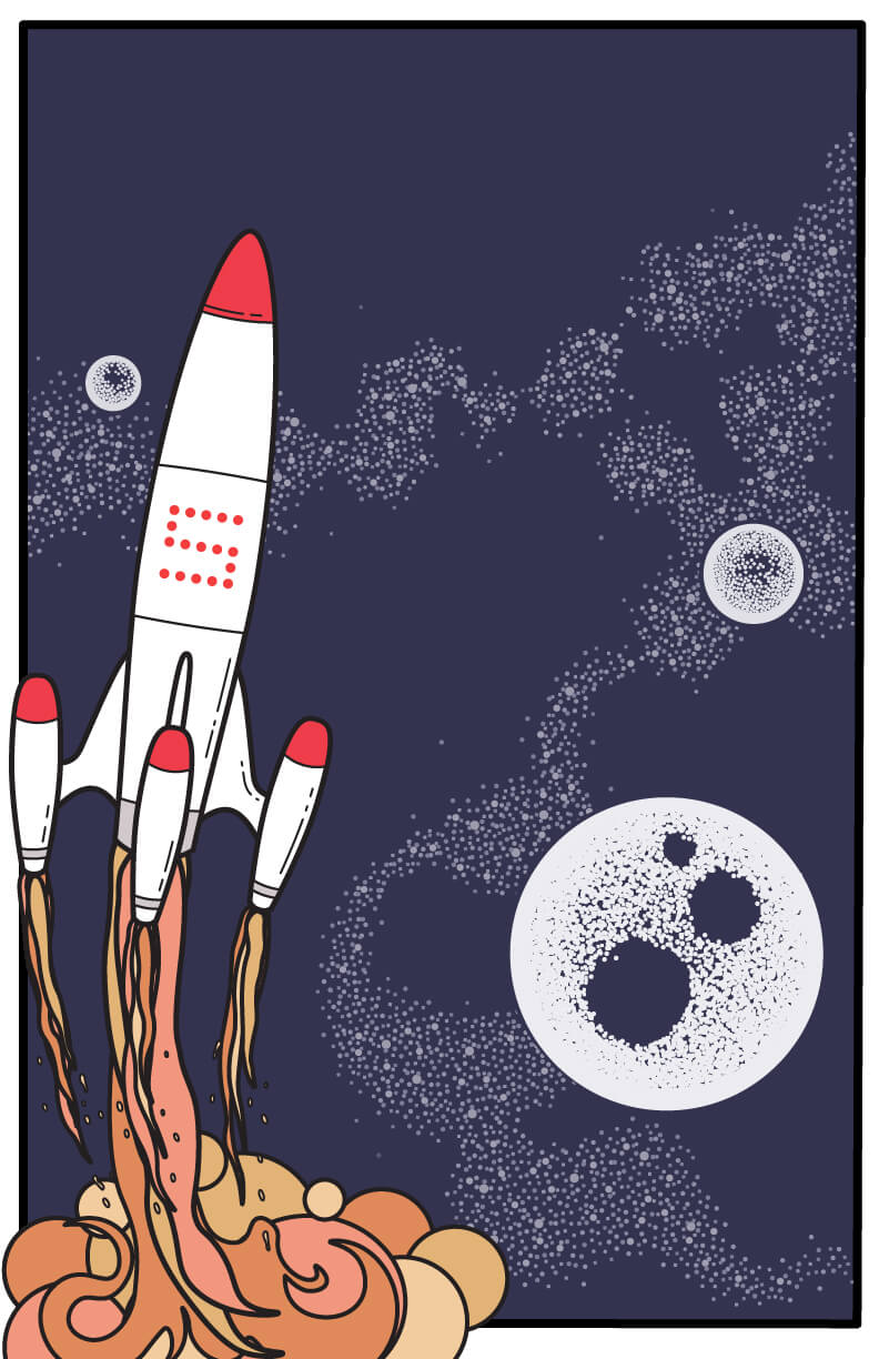
Color and Brushstrokes
Like everything else, there were a coupled of iterations of color, and brush stroke styles and weights. This is most noticeable with the flames.
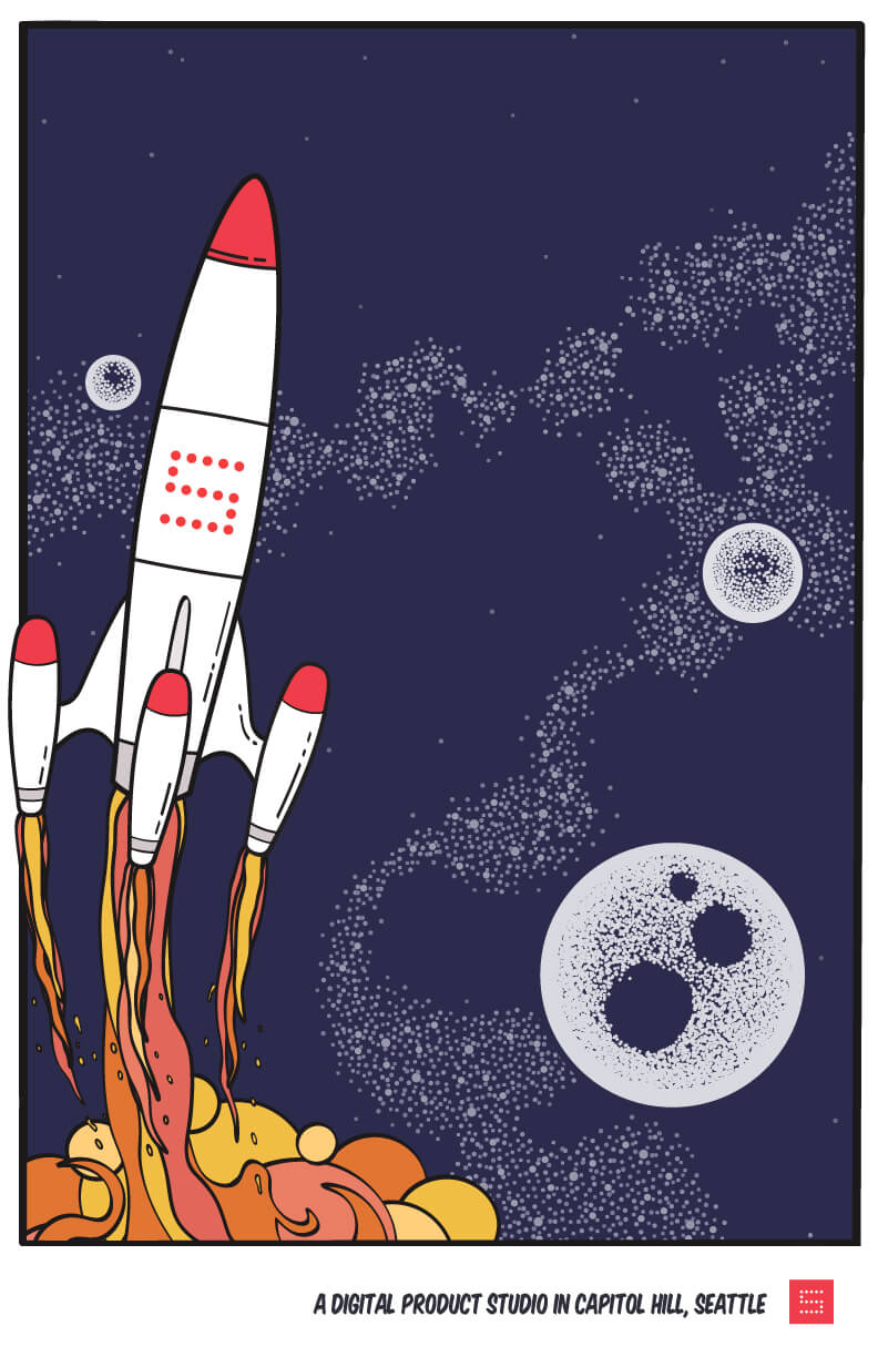
Ta da!
At the time of Geek Girl Con, Substantial was hiring for all positions. We wanted to make sure highlight that, but felt other information about Substantial could be found on the corporate website. We don’t take ourselves too seriously.
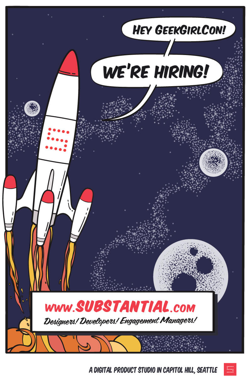
I don’t know if accomplished the exact aesthetic that I had originally targeted. But given the short turn around, I am happy with the outcome.